st_yled - Streamlit Styling and Components
New in st_yled 0.4: Tooltip component & Text Input Styling 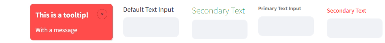
st_yled provides styling capabilities and improved components for Streamlit applications. Style your Streamlit apps with custom themes and unique elements to match your personal tone or corporate brand.
-
Custom styling for most elements: background colors, font size and more
-
New components like cards for stunning apps, built faster
-
st_yled studio app to configure your layouts and custom elements.
Check the offical st_yled docs https://st-styled.evo-byte.com/
✨ Features
🎨 CSS Integration - Load custom CSS files and apply styles seamlessly
🎯 Global Styling - Apply consistent styles across all elements
🔧 Elements - 44+ styled component wrappers with validation
🔧 New Components - 6+ new components like cards, headers or buttons
⚡ st_yled studio - Use the accompanying app to test your layout styling
🚀 Quick Start
Installation
Basic Usage
import streamlit as st
import st_yled

# Initialize st_yled (loads CSS from .streamlit/st-styled.css if available)
st_yled.init()

# Apply global styling to all buttons
st_yled.set("button", "background_color", "#ff6b6b")
st_yled.set("button", "border_style", "solid")

# Use enhanced components with styling
st_yled.button("Styled Button", background_color="#4ecdc4", color="white")
st_yled.text("Styled Text", color="#2c3e50", font_size="18px")

# Add st_yled components - like a badge card
st_yled.badge_card_one(
    badge_text="New",
    badge_icon=":material/star:",
    title="Featured Item",
    text="Check out this amazing feature",
)
📚 Documentation
Content
- Installation & Setup - Get started quickly
- API Reference - Core functions and usage
- st_yled Components - New component examples
- Element Examples - Basic element styling
- Styling Properties - Supported CSS properties
- Configuration - Advanced configuration options
📖 API Reference
Core Functions
st_yled.init(css_path=None)
Initialize st_yled with CSS styling.
Parameters: - css_path (str, optional): Path to custom CSS file. If not provided, looks for .streamlit/st-styled.css
Example:
st_yled.set(component, property, value)
Apply global styling to all components of a specific type.
Parameters: - component (str): Component type (e.g., "button", "text", "header") - property (str): CSS property name (e.g., "background_color", "font_size") - value (str): CSS property value (e.g., "#ff6b6b", "18px")
Example:
# Style all buttons
st_yled.set("button", "background_color", "#3498db")
st_yled.set("button", "border_style", "solid")
st_yled.set("button", "color", "white")

# Style all headers
st_yled.set("header", "color", "#2c3e50")
st_yled.set("header", "font_size", "24px")
🎨 st_yled Components
st_yled provides new custom components that extend Streamlit's functionality with pre-built UI patterns. A full list of new st_yled components can be found here: st_yled component docs
Card Components
# Badge card with icon and styled badge
st_yled.badge_card_one(
    badge_text="New",
    badge_icon=":material/star:",
    title="Featured Item",
    text="Check out this amazing feature",
)
Layout Components
# Sticky header that stays visible while scrolling
st_yled.sticky_header(
    "My App Title",
    background_color="#ffffff",
    border_bottom="2px solid #e0e0e0"
)
Input Components
# Split button with dropdown actions
st_yled.split_button(
    primary_label="Save",
    actions=["Save as Draft", "Save and Publish", "Save as Template"]
)
See st_yled component docs for full list and detailed documentation
🔧 Elements
St_yled provides enhanced versions of Streamlit elements with additional styling parameters:
Text Elements
st_yled.title("My Title", color="#2c3e50", font_size="2.5rem")
st_yled.header("Section Header", color="#3498db")
st_yled.subheader("Subsection", color="#7f8c8d", font_size="1.5rem")
st_yled.text("Regular text", font_size="16px", color="#2c3e50")
st_yled.markdown("**Bold text**", color="#e74c3c")
st_yled.caption("Small caption", color="#95a5a6", font_size="14px")
Interactive Elements
st_yled.button("Click Me", background_color="#e74c3c", color="white")
st_yled.text_input("Name", background_color="#f8f9fa", color="#2c3e50")
st_yled.selectbox("Choose", options=["A", "B"], background_color="#f8f9fa")
st_yled.slider("Value", 0, 100, color="#2ecc71")
Layout Elements
# Styled containers (only background_color and border properties supported)
with st_yled.container(
    background_color="#f8f9fa",
    border_style="solid",
    border_color="#dee2e6",
    border_width="1px"
):
    st.write("Content inside styled container")

# Standard columns (st_yled.columns doesn't exist, use st.columns)
col1, col2 = st.columns(2)
Status Elements
# Status elements with styling (only color property supported)
st_yled.success(
    "Success message",
    color="#155724"
)

st_yled.info(
    "Info message",
    color="#0c5460"
)

st_yled.warning(
    "Warning message",
    color="#856404"
)

st_yled.error(
    "Error message",
    color="#721c24"
)
🎨 Element Coverage
St_yled supports 43 styled elements with comprehensive CSS property support:
- Text Elements (9): title, header, subheader, text, markdown, caption, code, latex, json
- Interactive Elements (16): button, download_button, text_input, text_area, number_input, selectbox, multiselect, slider, select_slider, checkbox, radio, toggle, color_picker, file_uploader, pills, form_submit_button
- Layout Elements (3): container, expander, tabs
- Status Elements (4): success, info, warning, error
- Data Elements (4): table, metric, progress, status
- Chat Elements (1): chat_message
Check the st_yled element docs for more information
🛡️ Validation System
St_yled includes a comprehensive parameter validation system:
Validation Modes
- Permissive Mode (default): Invalid properties removed with warnings
- Strict Mode: Invalid properties raise
ValidationError - Bypass Mode: No validation (for advanced users)
Configuration
import os

# Enable strict validation (recommended for development)
os.environ["ST_STYLED_STRICT_VALIDATION"] = "true"

# Bypass validation (for performance-critical applications)
os.environ["ST_STYLED_BYPASS_VALIDATION"] = "true"
🎨 Styling Properties
Color Properties
- Valid formats: Hex (
#ff0000), RGB (rgb(255,0,0)), HSL (hsl(0,100%,50%)), Named (red) - Examples:
color,background_color,border_color
Size Properties
- Valid units:
px,em,rem - Examples:
font_size,width,height,padding,margin
Border Properties
- Styles:
solid,dashed,dotted,double, ... - Examples:
border,border_radius,border_width,border_style
See Component Reference for complete property details.
🚀 Advanced Usage
Custom Themes
def apply_dark_theme():
    st_yled.set("title", "color", "#ffffff")
    st_yled.set("container", "background_color", "#1f2937")
    st_yled.set("button", "background_color", "#3b82f6")
    st_yled.set("button", "color", "#ffffff")

apply_dark_theme()
Dashboard Layouts
# Professional metric cards
col1, col2, col3 = st.columns(3)

with col1:
    with st_yled.container(
        background_color="#f8fafc",
        border="1px solid #e2e8f0",
        border_radius="12px",
    ):
        st_yled.metric("Revenue", "$2.4M", "+12%", color="#059669")
🔧 Configuration
CSS File Locations
St_yled looks for CSS files in the following order:
- Custom path provided to
st_yled.init(css_path) .streamlit/st-styled.cssin current working directory~/.streamlit/st-styled.cssin home directory
Styling Priority
Styles are applied in priority order (highest to lowest):
- Inline component styling parameters
- Global styles set with
st_yled.set() - CSS file styles
- Default Streamlit styles
Environment Variables
# Validation configuration
export ST_STYLED_STRICT_VALIDATION=true   # Enable strict validation
export ST_STYLED_BYPASS_VALIDATION=true   # Bypass all validation
📝 License
This project is licensed under the MIT License - see the LICENSE file for details.
🔗 Links
- 🐙 Source Code: GitHub Repository
- 🐛 Issue Tracker: GitHub Issues
- 📦 PyPI Package: st-styled
❓ Support
If you encounter any issues or have questions:
- 📖 Check the comprehensive documentation
- 🔍 Search existing issues
- 💬 Create a new issue
- 📧 Contact the maintainers
Made with ❤️ by EVOBYTE for the Streamlit community
Transform your Streamlit apps with professional styling and comprehensive validation.