Status Components
Status components help you communicate guidance, context, and lightweight feedback in your Streamlit applications.
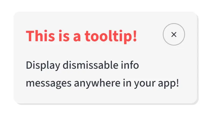
Tooltip
A dismissible tooltip component for showing contextual information anywhere on the page.
Description
The tooltip component renders a floating information box with a title, message, and close button. It is useful for onboarding cues, release notes, inline hints, and temporary notices that should not take up permanent layout space.
Usage Pattern
Use this component to provide additional information or context without cluttering the main interface. Because the tooltip can be positioned freely and dismissed by the user, it works well for feature announcements, setup guidance, and non-blocking notifications.
Basic Example
import st_yled

st_yled.init()

st_yled.tooltip(
    title="Quick Hint",
    text="Use st_yled for better layouts.",
    background_color="#ff4b4b",
    title_color="#ffffff",
    text_color="#ffffff",
    key="tooltip-1",
)
Quick Start
Parameters
title(str): Tooltip header texttext(str): Tooltip body textwidth(int): Tooltip width in pixels (default: 230)top(str): CSS top offset such as"90px"or"2rem"left(str): CSS left offset such as"50px"or"10%"background_color(str, optional): Tooltip background colorshadow(bool): Enable tooltip shadow (default: True)title_font_size(int | str, optional): Title font sizetitle_color(str, optional): Title text colortitle_font_weight(str, optional): Title font weighttext_font_size(int | str, optional): Body text font sizetext_color(str, optional): Body text colortext_font_weight(str, optional): Body text font weightshow(bool): Whether the tooltip is visible on initial render (default: True)key(str, optional): Unique key for the component
Usage Examples
Feature Announcement:
st_yled.tooltip(
    title="New Feature",
    text="Try the studio app to configure your layouts.",
    background_color="#f3e8ff",
    title_color="#1f2937",
    text_color="#374151",
    top="120px",
    left="32px",
    key="tooltip-feature-announcement",
)
Hidden by Default:
st_yled.tooltip(
    title="Advanced Tip",
    text="This tooltip starts hidden until you choose to show it.",
    show=False,
    top="180px",
    left="48px",
    key="tooltip-hidden-default",
)
Usage Notes
- Tooltips are rendered with fixed positioning, so
topandleftdetermine their placement in the viewport - The component is dismissible and stays hidden after the user clicks the close button
- Use a unique
keywhen rendering multiple tooltips on the same page - Tooltips are best suited for temporary or supporting information rather than primary content
Next Steps
Explore more component categories:
- Card Components - Beautiful card layouts
- Layout Components - Advanced layout controls
- Input Components - Enhanced input controls
st_yled with ❤️ from EVOBYTE