Card Components
Card components provide beautiful, organized containers for displaying content in your Streamlit applications.
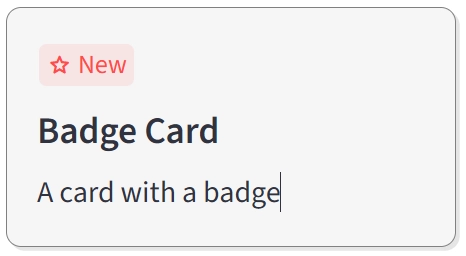
Badge Card One
A card component with a customizable badge at the top-left corner.
Description
A card component with a badge at the top-left corner, perfect for highlighting special features, promotions, or status indicators.
Usage Pattern
Use this component to highlight special features, promotions, or status indicators. Perfect for showcasing new items, featured content, sale badges, or premium offerings in a visually appealing card format.
Basic Example
import st_yled

st_yled.init()

st_yled.badge_card_one(
    badge_text="New",
    badge_icon=":material/star:",
    title="Badge Card",
    text="A card with a badge",
    width=240,
    title_font_size=20,
    background_color="#F6F6F6",
    border_color="grey",
    border_style="solid",
    border_width=1,
    key="badge-card-1",
)
Quick Start
Parameters
badge_text(str): Text displayed in the badgebadge_icon(str, optional): Material icon for the badgetitle(str): Card titletext(str): Card description textwidth(int | str): Card width in pixels or CSS unitstitle_font_size(int, optional): Font size for the titlebackground_color(str, optional): Card background colorborder_color(str, optional): Border colorborder_style(str, optional): Border style (solid, dashed, dotted)border_width(int, optional): Border width in pixelskey(str, optional): Unique key for the component
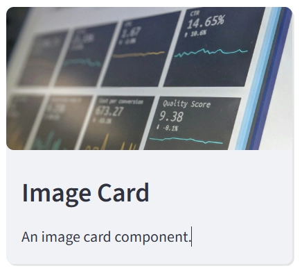
Image Card One
A card component with an image at the top.
Description
A card component with an image at the top, ideal for visual content display.
Usage Pattern
Use this component to display visual content like products, portfolio items, blog posts, or team members. Perfect for creating galleries, catalogs, or any content where images play a central role in conveying information.
Basic Example
import st_yled

st_yled.init()

st_yled.image_card_one(
    image_path="https://example.com/image.jpg",
    title="Image Card",
    text="A card with an image at the top",
    width=300,
    title_font_size=18,
    background_color="#FFFFFF",
    card_shadow=True,
    border_color="#E0E0E0",
    border_style="solid",
    border_width=1,
    key="image-card-1",
)
Quick Start
Parameters
image_path(str): URL or path to the imagetitle(str): Card titletext(str): Card description textwidth(int | str): Card width (default: 300)height(int | str): Card height (default: "content")background_color(str, optional): Card background colorcard_shadow(bool): Enable card shadow (default: True)border_width(int, optional): Border width in pixelsborder_color(str, optional): Border colorborder_style(str, optional): Border style (solid, dashed, dotted)title_font_size(int, optional): Font size for the titletitle_font_weight(str, optional): Font weight for the titletitle_color(str, optional): Title text colortext_font_size(int, optional): Font size for the texttext_font_weight(str, optional): Font weight for the texttext_color(str, optional): Text colorkey(str, optional): Unique key for the component
Next Steps
Explore more component categories:
- Layout Components - Advanced layout controls
- Navigation Components - Routing and navigation
- Input Components - Enhanced input controls
st_yled with ❤️ from EVOBYTE