New in st_yled 0.4: Tooltip component & Text Input Styling 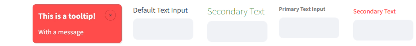
Streamlit Component Style Library
-
Custom styling for most elements: background colors, font size and more
-
New components like cards for stunning apps, built faster
-
st_yled studio: Configure component styles interactively
Streamlit is great - but styling individual elements is a hassle. st_yled solves this by providing a simple way for styling Streamlit elements and many new components to upgrade your apps.
Quick Start (5 minutes)
0. Check st_yled studio
st_yled studio is a free app to test and optimize your Streamlit layouts, UI styling and explore new components. Your directly export your layouting into your Streamlit app using st_yled together with the studio app.
Here is the link to st_yled studio
1. Install st_yled
2. Create your first styled app
import streamlit as st
import st_yled

# Initialize styling - set for each app page
st_yled.init()

# Style all buttons globally with a lightblue background
st_yled.set("button", "background_color", "lightblue")

# Use enhanced elements to style the (text) color of a single button
st_yled.button("Styled Button", color="white")

# Or the color of the title
st_yled.title("Welcome!", color="#57cf1cff")

# Add st_yled components - like a badge card
st_yled.badge_card_one(
    badge_text="New",
    badge_icon=":material/star:",
    title="Featured Item",
    text="Check out this amazing feature",
)
3. Run your app
That's it! Your Streamlit app now has professional styling with just a few lines of code.
What Makes st_yled Special?
Simple Yet Powerful
# Initialize styling - set for each app page
st_yled.init()

# Global styling - affect all elements of a type
st_yled.set("button", "background_color", "lightblue")

# Individual styling - customize specific elements
st_yled.button("Click me!", background_color="#4ecdc4")
This works for almost all Streamlit elements!
st_yled studio: Try and optimize your Streamlit styling
st_yled studio is an open and free webapp for you to try, configure and optimize theming and styling of you Streamlit app.
Here is the link to st_yled studio
Once optimized, you can export your app layout and save in the .streamlit folder of your app. st_yled will automatically make use of your custom layout.
Component Library
st_yled components speed up your app development and provide new functions and layouts.
Comprehensive Validation, Production Ready
st_yled validates all CSS properties and provides helpful error messages, preventing common styling mistakes and ensuring your app looks great across different browsers.
Get Started
Ready to transform your Streamlit apps? Choose your learning path:
- New to st_yled? → Installation Guide
- Want to see examples? → Examples Gallery
- More components → st_yled components
- Need specific elements? → Component Reference
- Advanced usage? → API Documentation
Key Features
✨ New Components - Access ready-to-use components like badge cards
🎨 CSS Integration - Load custom CSS files and apply styles seamlessly
🎯 Global Styling - Apply consistent styles across all elements
🔧 Enhanced Elements - 44+ styled component wrappers with validation
⚡ st_yled studio - Use the accompanying app to test your layout styling
Documentation Sections
Getting Started
Step-by-step tutorials for new users, from installation to your first styled app.
Elements
Complete reference for all 44+ stylable elements with examples and options.
Examples
Ready-to-run example applications organized by difficulty and use case.
API Reference
Detailed documentation for all functions, parameters, and configuration options.
st_yled with ❤️ from EVOBYTE